I’ve been itching for change lately, and now that I have all this spare time on my hands I’ve been working on some “projects” that I’ve wanted to do for a while.
My most recently completed one was the bedroom makeover!
My old room was awesome, but it was cluttered, busy and not very relaxing. I had my computer desk in there and basically did everything in that room. It wasn’t a very peaceful environment to fall asleep in, or just relax in general. I have issues with sleep as it is, so I decided that I’d make a big change and move the desk out and do the room over in an effort to make it more serene.
I moved the desk into my media room/spare room (Photos to come!) and set to work.
Working With What I Had
The biggest challenge was trying to get all my disparate elements to come together, with little money. I really didn’t have a budget at all.
Everything in my room is second-hand. I don’t think there is a single piece of furniture in there that is new! That certainly posed a unique challenge. I also fell in love with the purple bed set on vacation and had to work a new colour into my palette that wasn’t there before. Originally I was aiming for whites & pinks since I had a white bedspread and pink pillows & curtains to work with. Then I remembered I wanted to bring my big black chaise into the room for a reading nook. *sigh* there’s another colour to work with!
So now I had 4 main colour accents: Purple, pinks, white & black.
Goals
The goals for this room makeover were:
- Create more space both physically and optically
- Declutter & organize
- Use the furniture and stuff I already had and find a way to unify it better
- Make the room more functional with separate spaces for makeup, jewellery/accessories, sleeping and reading
- Make a more relaxing and calm space
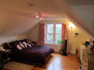
My main inspiration for this room is the pink & cream bird curtains. I made them when I moved in and I still love them! In the photos below, see if you can pick out all the little bird elements I used to tie everything together!
Since I was starting with the curtains, I decided to go with a lighter wall colour to brighten & enlarge the room. I picked a very light, creamy bone shade that closely matched the cream in the curtains. It’s a neutral enough shade to achieve all my goals and provide a nice backdrop for the splashes of colour in the art & accessories.
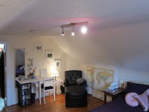
With the desk gone from my room there was tons of space for a new vanity and reading area. I got the black chaise off of Craigslist last year and the “vanity” that you see is actually a sewing table from my late aunt. I think she’d be happy with how I arranged it! I also had an old chair sitting around the apartment, so I painted it and upholstered the seat in a shiny black to match the chaise. My mom thought it came with the table! Score!
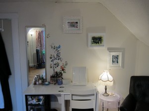
I also took this as an opportunity to go through all my accessories and prune them down. After that I had to find a creative way to keep most of them in sight so I could remember what I had! (I couldn’t keep them all out, I have an insane amount of stuff, so just the faves are on display)
I found an old cork board hiding in a storage space and my problem was solved! (Everyone knows the cork board trick for jewellery now, right?) I painted it the same colour as the walls so it would blend in and provide a good backdrop for my pretties. Not bad! Again, just working with what I had on hand, folks!
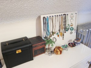
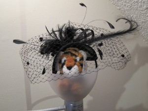
I also finally found a way to display some of my floral hair fascinators creatively, while finding a home for my tiered tray (that thing is impossible to store!!!!)
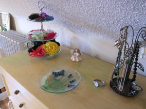
All said and done, I think I did a pretty swell job of pulling everything together, and I was able to achieve each of the goals I set out for this project.
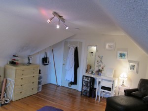
The funny thing about this room is that I really didn’t set out to have it bird-themed. It just sort of worked out that way. I went with the motif from the curtains and tried to have little details throughout to provide continuity. I may not have chosen this myself, but I think it worked out well! Sometimes you just have to let your project choose YOU.
Birds
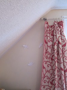
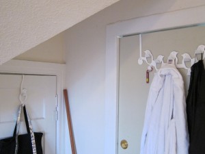
If you also like the bird theme, I got the hooks and white wall-birds from Umbra. I buy from the concept store downtown, but there are lots of other retailers that carry them as well. As for the spunky wall decal, I got it at the dollar store for $2!!! Amazeballs. I bought it months ago because it was pretty and it sat around until I finally realized I could use it in this project. Win!
Royal-Tiger approves this room makeover!
8 responses to “The Big Bedroom Makeover!”
Awesome makeover! Looks great, serene, relaxing, and colourful! I hope it helps you relax and get some sleep!
My recent post Sometimes I Wonder….
I absolutely love your room! The hardwood floors, the slopey-ceilings, oh my!
My favourite parts are the bird curtains and your royal tiger 😛
My recent post Last Week…
WOW!!! this is a fabulous makeover – you did a phenomenal job!
I just moved back to Toronto, and miss my old apartment in Calfornia terribly since I'd had it decorated just th way I want. My room right now is a bit drab -and plain, and this post just re-energized me! Imma gonna go fix up my room now 🙂
Totally agree with all of the above – you did a phenomenal job!!! I wish you could come do my room. I do not have a decorating sense whatsoever in me. You should be really proud of yourself.
It looks amazing. I love your reading corner…
My recent post Closet Cleanout #2 — Purses, Clothing, etc
WOW!!! Gorgeous, girl!!!! I am totally hiring you to help me redecorate when the time comes 🙂 I especially love the little table beside the chaise. That's something I've always wanted!
Aww, thanks Marianne! I'd be happy to help you out when you're ready 🙂
My recent post Rock the Vote! Round 1
Your room is lovely..it isn't over the top and is very liveable. I really like it.
My recent post Latex Vs Memory Foam – Which Foam For Your Mattress?